How Users Actually Discover Products in 2026
Design trends change fast. Gradients, animations, and complex layouts come and go. But conversion behavior hasn’t changed nearly as much as people think. Users don’t visit websites to admire them. They visit to understand, decide, and act.
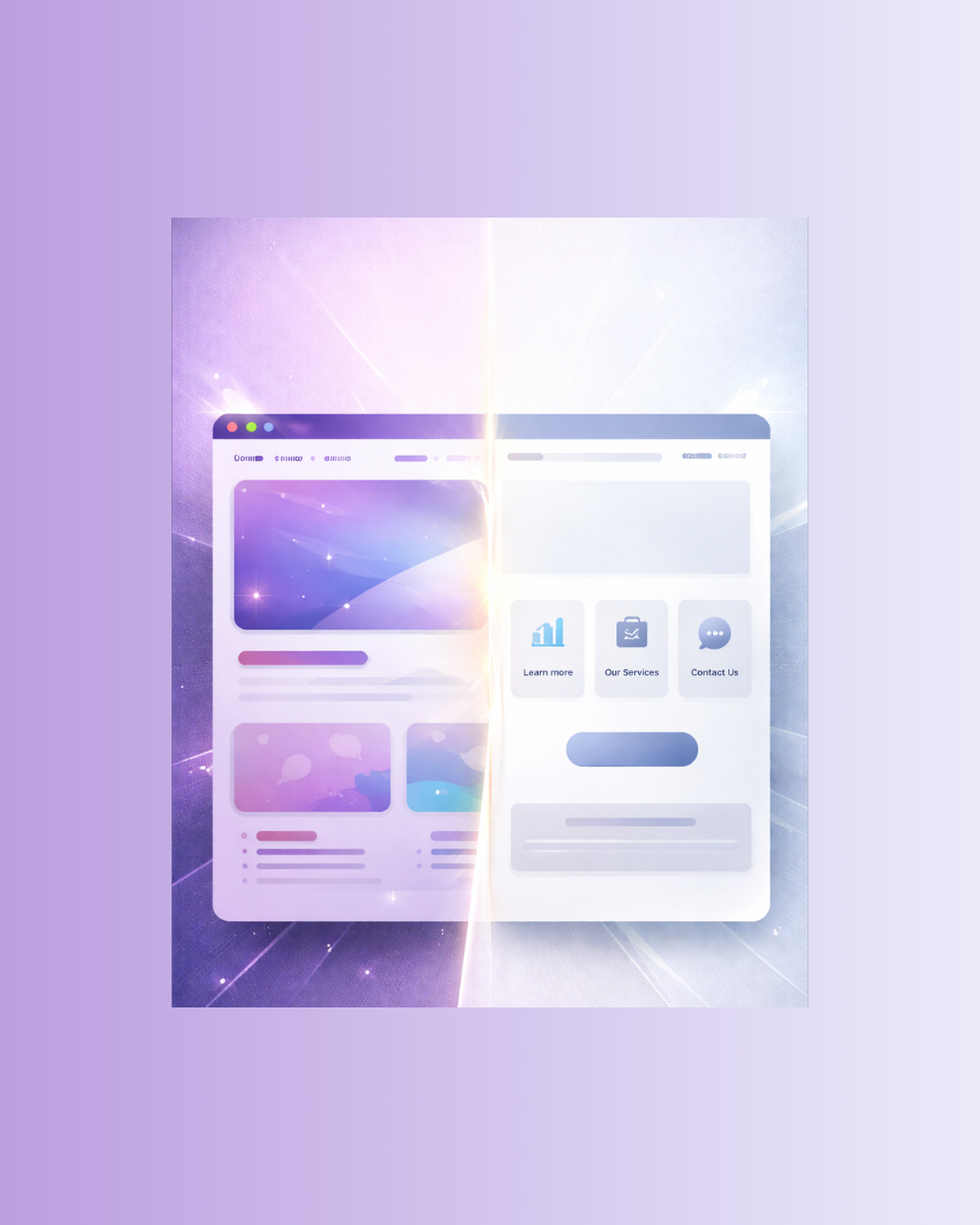
A website can look impressive and still fail at its only real job: converting visitors into customers.
Table of contents:
Why “Pretty” Became the Goal
Modern design tools and inspiration platforms have raised visual standards, but they’ve also shifted priorities.
Many websites are designed to impress other designers, stakeholders, or internal teams rather than real users. Visual polish becomes the metric of success, while usability and clarity take a back seat.
A beautiful website feels successful. A clear website is successful.
How Users Actually Read Websites
Users don’t read websites line by line. They scan. They look for:
Clear headlines
Immediate value propositions
Obvious next steps
If those aren’t visible within seconds, they leave—regardless of how refined the design looks.
Animations, complex layouts, and clever wording often slow users down instead of guiding them forward. When understanding takes effort, conversion drops. Confusion is the fastest way to lose attention.
Discovery now happens in feeds, not result pages.
Clarity vs Cleverness
Clever copy sounds good. Clear copy gets results. Phrases that try to be unique, poetic, or vague often fail to communicate what a business actually does. Users shouldn’t have to interpret messaging or guess the outcome of clicking a button.
Clarity answers three questions immediately:
What is this?
Who is it for?
What happens next?
If those answers aren’t obvious, design becomes decoration instead of direction.
What High-Converting Websites Do Differently
High-performing websites prioritize function over flair. They use:
Direct headlines that explain value instantly;
Simple layouts that guide attention;
Clear calls to action with predictable outcomes;
Consistent structure across pages.
Visual design still matters—but it supports the message instead of competing with it. Every element exists to reduce friction, not add personality for its own sake.
Good design disappears.
Bad design distracts.
Common Design Mistakes That Kill Conversions
Overdesigned Hero Sections: Large visuals with unclear messaging delay understanding.
Weak Calls to Action: Buttons like “Learn More” don’t tell users what they gain.
Hidden Information: Important details buried behind interactions or animations increase drop-off.
Design Before Strategy: Starting with visuals instead of messaging leads to beautiful confusion.
Final Thoughts
Pretty websites win compliments. Clear websites win customers.
Conversion-focused design is not about removing creativity—it’s about aligning creativity with purpose. When users understand what you offer and what to do next, trust increases and decisions happen faster.
The goal isn’t to impress. The goal is to convert.
Clarity always wins.
![]() Let's talk about your project!
Let's talk about your project!